Infographic & Education
Infographic Visualization Design
Original169 caracteres
Generate a 12-grid card image of the 12 Golden Saints from Saint Seiya, with each card featuring its corresponding Chinese name, 4 cards per row, in a 16:9 aspect ratio.

Generate a 12-grid card image of the 12 Golden Saints from Saint Seiya, with each card featuring its corresponding Chinese name, 4 cards per row, in a 16:9 aspect ratio.
Más ejemplos de la misma categoría visual.
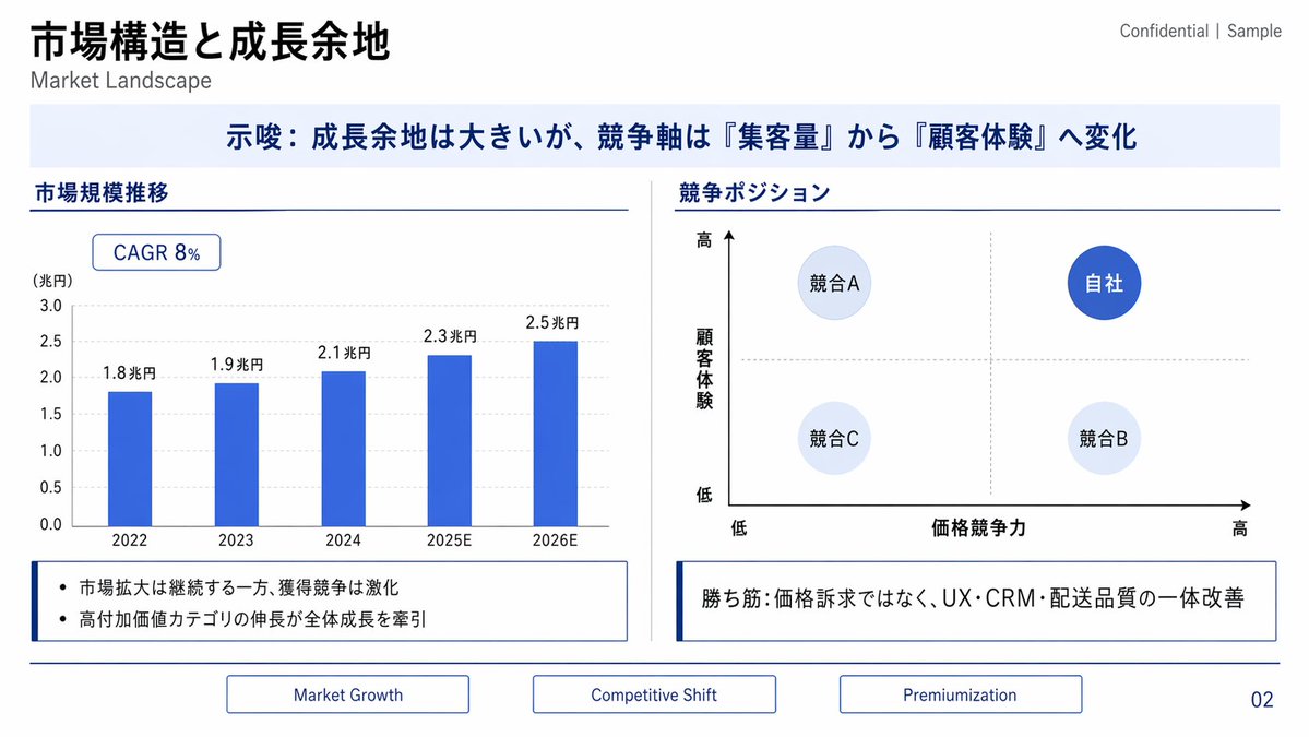
{"type":"corporate consulting presentation slide","language":"Japanese with small English subtitles","format":"16:9 widescreen slide, clean white background, navy and royal blue business style","title":"{argument name=\"main title\" default=\"市場構造と成長余地\"}","subtitle":"Market Landscape","top_right_label":"Confidential | Sample","page_number":"02","theme":{"primary_color":"deep navy","accent_color":"royal blue","secondary_color":"pale blue","lines":"thin navy divider lines","typography":"modern sans-serif, bold Japanese headings, restrained consulting-deck style"},"layout":{"top":{"position":"upper left","content":"large bold Japanese title with smaller English subtitle underneath; confidentiality label at upper right"},"key_message_banner":{"position":"full width below title","background":"very pale blue rectangle","text":"{argument name=\"key message\" default=\"示唆:成長余地は大きいが、競争軸は『集客量』から『顧客体験』へ変化\"}","style":"centered bold navy Japanese text"},"main_content":{"columns":2,"divider":"thin vertical gray line between columns","left_section":{"title":"市場規模推移","type":"bar chart","position":"left half","chart_details":{"badge":"CAGR 8%","y_axis_label":"(兆円)","y_axis_range":"0.0 to 3.0","gridlines":"light gray dotted horizontal gridlines","bar_count":5,"bars":[{"year":"2022","value_label":"1.8兆円"},{"year":"2023","value_label":"1.9兆円"},{"year":"2024","value_label":"2.1兆円"},{"year":"2025E","value_label":"2.3兆円"},{"year":"2026E","value_label":"2.5兆円"}],"bar_style":"solid royal blue vertical bars"},"note_box":{"count":2,"bullets":["市場拡大は継続する一方、獲得競争は激化","高付加価値カテゴリの伸長が全体成長を牽引"],"style":"outlined white box with navy left accent line"}},"right_section":{"title":"競争ポジション","type":"2x2 positioning matrix","position":"right half","matrix_details":{"x_axis":"価格競争力","x_axis_left":"低","x_axis_right":"高","y_axis":"顧客体験","y_axis_bottom":"低","y_axis_top":"高","axis_arrows":"black arrows pointing right and upward","crosshair":"light gray dotted vertical and horizontal midpoint lines","bubble_count":4,"bubbles":[{"label":"競合A","position":"upper left","style":"pale blue circle"},{"label":"自社","position":"upper right","style":"dark royal blue circle with white text"},{"label":"競合C","position":"lower left","style":"very pale blue circle"},{"label":"競合B","position":"lower right","style":"very pale blue circle"}]},"note_box":{"text":"{argument name=\"right insight text\" default=\"勝ち筋:価格訴求ではなく、UX・CRM・配送品質の一体改善\"}","style":"outlined white box with navy left accent line"}}},"bottom_navigation":{"position":"bottom center","tab_count":3,"tabs":["Market Growth","Competitive Shift","Premiumization"],"style":"three thin outlined rectangular tabs in navy, evenly spaced"}},"composition":"precise slide grid, generous margins, horizontal navy rules separating header/content/footer, polished strategy-consulting PowerPoint aesthetic, no photos or illustrations, sharp vector graphics"}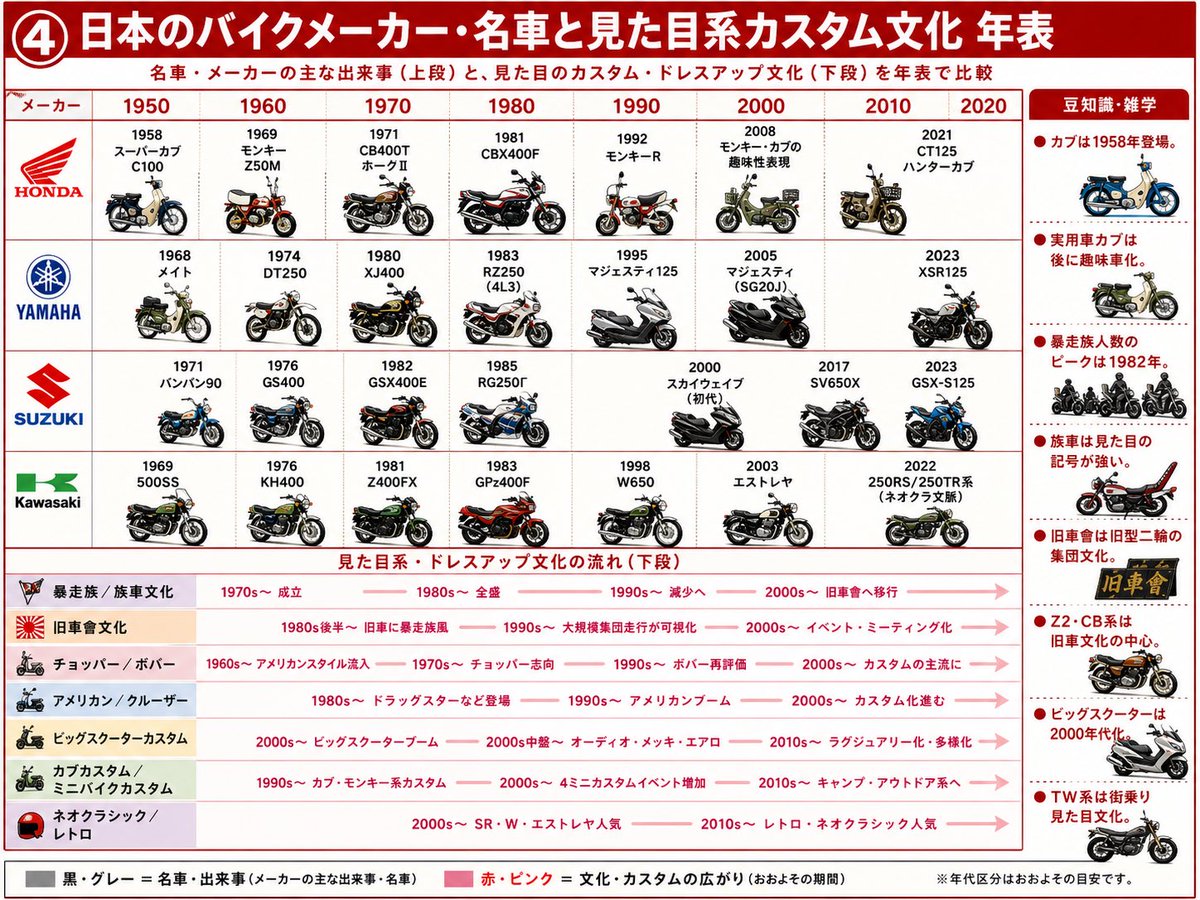
{"type":"Japanese infographic timeline poster","language":"Japanese","canvas":"landscape 4:3 educational chart with a clean white background, red grid lines, bold red title bar, small motorcycle illustrations, and dense Japanese annotations","headline":"{argument name=\"headline text\" default=\"④ 日本のバイクメーカー・名車と見た目系カスタム文化 年表\"}","subtitle":"名車・メーカーの主な出来事(上段)と、見た目のカスタム・ドレスアップ文化(下段)を年表で比較","layout":{"top_timeline":{"position":"upper two thirds","description":"matrix comparing 4 Japanese motorcycle manufacturers across 8 decade columns, with each cell showing a year, model name, and small detailed side-view motorcycle illustration","columns_count":8,"columns":["1950","1960","1970","1980","1990","2000","2010","2020"],"rows_count":4,"rows":[{"maker":"HONDA","logo_style":"red wing logo and HONDA text","entries_count":8,"entries":["1958 スーパーカブ C100","1969 モンキー Z50M","1971 CB400T ホークⅡ","1981 CBX400F","1992 モンキーR","2008 モンキー・カブの趣味性表現","2010 custom-style small bike illustration","2021 CT125 ハンターカブ"]},{"maker":"YAMAHA","logo_style":"blue tuning-fork circle logo and YAMAHA text","entries_count":7,"entries":["1968 メイト","1974 DT250","1980 XJ400","1983 RZ250 (4L3)","1995 マジェスティ125","2005 マジェスティ (SG20J)","2023 XSR125"]},{"maker":"SUZUKI","logo_style":"red S logo and SUZUKI text","entries_count":8,"entries":["1971 バンバン90","1976 GS400","1982 GSX400E","1985 RG250Γ","2000 スカイウェイブ(初代)","2017 SV650X","2023 GSX-S125","one empty/spacing decade cell to preserve grid alignment"]},{"maker":"Kawasaki","logo_style":"green Kawasaki mark and text","entries_count":8,"entries":["1969 500SS","1976 KH400","1981 Z400FX","1983 GPz400F","1998 W650","2003 エストレヤ","2022 250RS/250TR系(ネオクラ系譜)","one empty/spacing decade cell to preserve grid alignment"]}]},"bottom_culture_timeline":{"position":"lower third","section_title":"見た目系・ドレスアップ文化の流れ(下段)","description":"7 horizontal culture rows with pale colored category labels on the left and pink arrows showing approximate periods of popularity","rows_count":7,"rows":[{"label":"暴走族/族車文化","icon":"small aggressive motorcycle emblem","timeline":"1970s〜成立 → 1980s〜全盛 → 1990s〜減少へ → 2000s〜旧車會へ移行"},{"label":"旧車會文化","icon":"rising-sun style icon","timeline":"1980s後半〜旧車に暴走族風 → 1990s〜大規模集団走行が可視化 → 2000s〜イベント・ミーティング化"},{"label":"チョッパー/ボバー","icon":"chopper motorcycle silhouette","timeline":"1960s〜アメリカンスタイル流入 → 1970s〜チョッパー志向 → 1990s〜ボバー再評価 → 2000s〜カスタムの主流に"},{"label":"アメリカン/クルーザー","icon":"cruiser motorcycle silhouette","timeline":"1980s〜ドラッグスターなど登場 → 1990s〜アメリカンブーム → 2000s〜カスタム化進む"},{"label":"ビッグスクーターカスタム","icon":"large scooter silhouette","timeline":"2000s〜ビッグスクーターブーム → 2000s中盤〜オーディオ・メッキ・エアロ → 2010s〜ラグジュアリー化・多様化"},{"label":"カブカスタム/ミニバイクカスタム","icon":"green small bike silhouette","timeline":"1990s〜カブ・モンキー系カスタム → 2000s〜4ミニカスタムイベント増加 → 2010s〜キャンプ・アウトドア系へ"},{"label":"ネオクラシック/レトロ","icon":"red helmet icon","timeline":"2000s〜SR・W・エストレヤ人気 → 2010s〜レトロ・ネオクラシック人気"}]},"right_sidebar":{"position":"right edge","title":"豆知識・雑学","style":"vertical column with red bullet dots, dotted separators, and 8 small motorcycle or emblem illustrations","facts_count":8,"facts":["カブは1958年登場。","実用車カブは後に趣味車化。","暴走族人数のピークは1982年。","族車は見た目の記号が強い。","旧車會は旧型二輪の集団文化。","Z2・CB系は旧車文化の中心。","ビッグスクーターは2000年代に。","TW系は街乗り見た目文化。"]},"footer":{"legend_count":2,"legend":["黒・グレー=名車・出来事(メーカーの主な出来事・名車)","赤・ピンク=文化・カスタムの広がり(おおよその期間)"],"note":"※年代区分はおおよその目安です。"}},"visual_style":{"typography":"bold Japanese sans-serif, red headings, compact black labels, clear chart hierarchy","colors":"dominant red and white, pale pink arrows, light beige/pink/green/lavender category strips, maker logos in brand colors","illustration_style":"small crisp semi-realistic side-view motorcycle drawings with shadows, varied colors and eras, infographic clarity rather than photorealism","rendering":"high-resolution print-ready poster, sharp legible text, neat grid alignment, educational magazine style"}}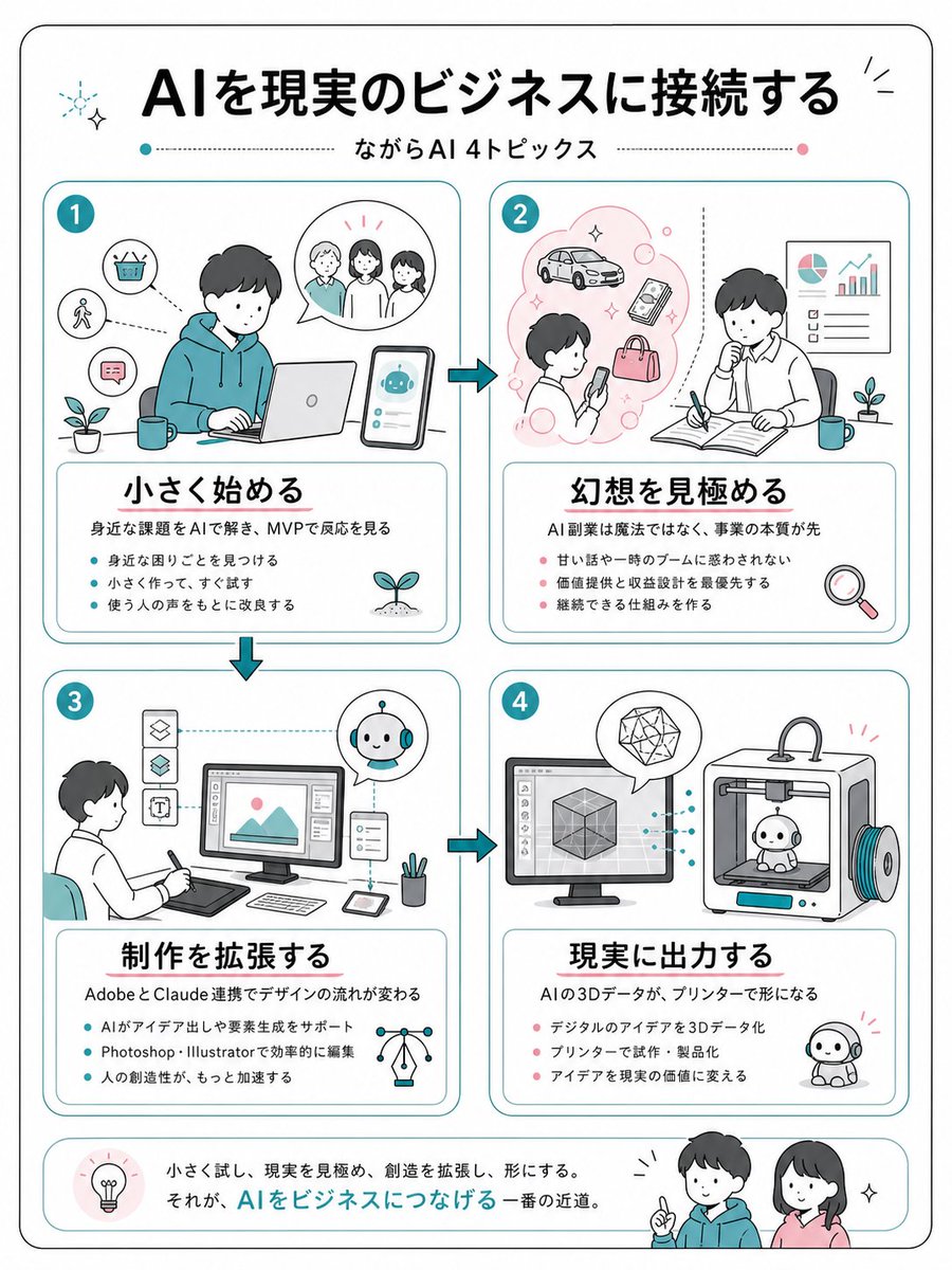
{"type":"clean Japanese business infographic poster","format":"vertical A4-like page with rounded black outer border on white background","style":"friendly flat line illustration, minimal teal and coral accent colors, soft rounded rectangles, hand-drawn business sketch feel, black Japanese gothic headline typography, thin teal dividers, small sparkle and plant icons","language":"Japanese","headline":"{argument name=\"headline text\" default=\"AIを現実のビジネスに接続する\"}","subtitle":"{argument name=\"subtitle text\" default=\"ながらAI 4トピックス\"}","layout":{"top":"large centered headline with small decorative sparkles, subtitle below between dotted horizontal lines with teal and pink dots","main_grid":"four equal rounded cards arranged in a 2 by 2 grid, connected by teal arrow icons showing flow from 1 to 2, down to 3, across to 4","bottom_banner":"rounded summary strip with a lightbulb icon at left, Japanese closing sentence in the center, and two friendly characters at right"},"sections":[{"number":"1","position":"top left","title":"{argument name=\"section 1 title\" default=\"小さく始める\"}","main_illustration":"young person in teal hoodie working on a laptop at a desk, smartphone beside them showing a cute AI robot chat interface, speech bubble with three people, small icons for basket, walking person, chat message, plant and mug","description":"身近な課題をAIで解き、MVPで反応を見る","bullet_count":3,"bullets":["身近な困りごとを見つける","小さく作って、すぐ試す","使う人の声をもとに改良する"]},{"number":"2","position":"top right","title":"{argument name=\"section 2 title\" default=\"幻想を見極める\"}","main_illustration":"person looking at a smartphone inside a pink idea cloud with car, phone, bag and bubbles; second person thinking while writing in an open notebook, wall chart with pie chart and rising bar graph, plant, mug, magnifying glass icon","description":"AI副業は魔法ではなく、事業の本質が先","bullet_count":3,"bullets":["甘い話や一時のブームに惑わされない","価値提供と収益設計を最優先する","継続できる仕組みを作る"]},{"number":"3","position":"bottom left","title":"{argument name=\"section 3 title\" default=\"制作を拡張する\"}","main_illustration":"designer seated with pen tablet facing a desktop monitor showing an image editing interface, vertical tool icons at left, small AI robot assistant in circular bubble, tablet, stylus, pen cup, network lightbulb icon","description":"AdobeとClaude連携でデザインの流れが変わる","bullet_count":3,"bullets":["AIがアイデア出しや要素生成をサポート","Photoshop・Illustratorで効率的に編集","人の創造性が、もっと加速する"]},{"number":"4","position":"bottom right","title":"{argument name=\"section 4 title\" default=\"現実に出力する\"}","main_illustration":"desktop monitor with 3D cube modeling software connected by dotted teal lines to a 3D printer printing a small cute robot figure, geometric crystal in speech bubble, finished robot mascot on the floor","description":"AIの3Dデータが、プリンターで形になる","bullet_count":3,"bullets":["デジタルのアイデアを3Dデータ化","プリンターで試作・製品化","アイデアを現実の価値に変える"]}],"bottom_summary":{"icon":"lightbulb in a pale pink circle","text":"小さく試し、現実を見極め、創造を拡張し、形にする。\nそれが、AIをビジネスにつなげる一番の近道。","characters":"two smiling young people, one in teal hoodie pointing upward and one woman in pink top, with small sparkle marks"},"visual_requirements":"Use exactly 4 numbered topic cards, exactly 3 bullet points in each card, Japanese text must be crisp and readable, maintain generous margins, rounded corners, teal card borders, coral bullet dots in sections 2 and 4, teal bullet dots in sections 1 and 3, no photorealism."}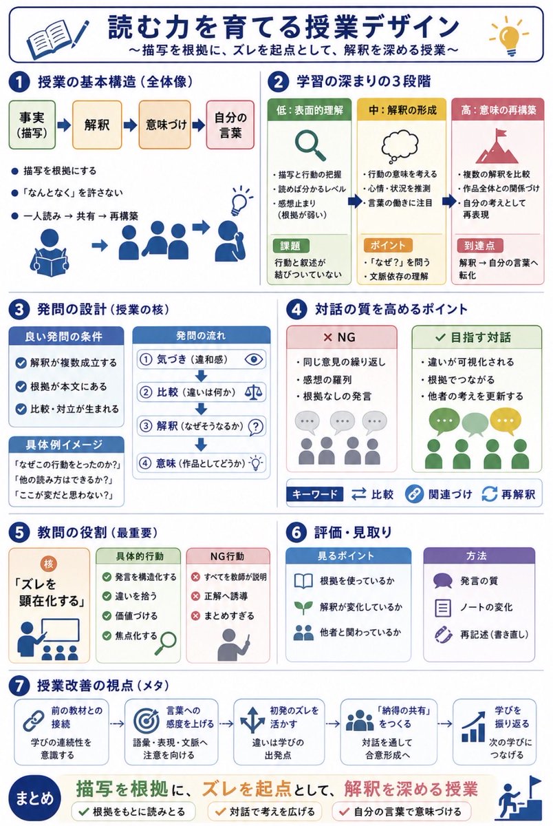
Using REFERENCE_0 and REFERENCE_1 as messy handwritten study-note sources, convert the content into a clean vertical Japanese educational infographic for quick sharing with teachers. Preserve the core topic about designing reading lessons for narrative texts, but organize it visually instead of reproducing the notebook pages. Create a polished white-background layout with navy section headers, rounded cards, simple flat icons, arrows, checkmarks, and color-coded boxes. Add the main title {argument name="headline text" default="読む力を育てる授業デザイン"} and subtitle {argument name="subtitle text" default="〜描写を根拠に、ズレを起点として、解釈を深める授業〜"}. Structure the infographic into exactly 7 numbered sections plus a final summary band: 1) lesson basic structure with four steps labeled 事実(描写)→ 解釈 → 意味づけ → 自分の言葉, 2) three stages of learning depth labeled 低:表面的理解, 中:解釈の形成, 高:意味の再構築, 3) question design with good-question conditions, question flow, and concrete example prompts, 4) points for improving dialogue quality with two comparison cards labeled NG and 目指す対話 plus keyword chips 比較, 関連づけ, 再解釈, 5) the teacher’s most important role centered on making “ズレ” visible with cards for concrete actions and NG actions, 6) assessment and observation with two cards labeled 見るポイント and 方法, and 7) meta viewpoints for lesson improvement shown as five connected cards: 前の教材との接続, 言葉への感度を上げる, 初発のズレを活かす, 「納得の共有」をつくる, 学びを振り返る. End with a prominent summary statement {argument name="summary statement" default="描写を根拠に、ズレを起点として、解釈を深める授業"} and three check items: 根拠をもとに読みとる, 対話で考えを広げる, 自分の言葉で意味づける. Make the result look like a professionally designed Japanese teaching handout, not a photo of notes.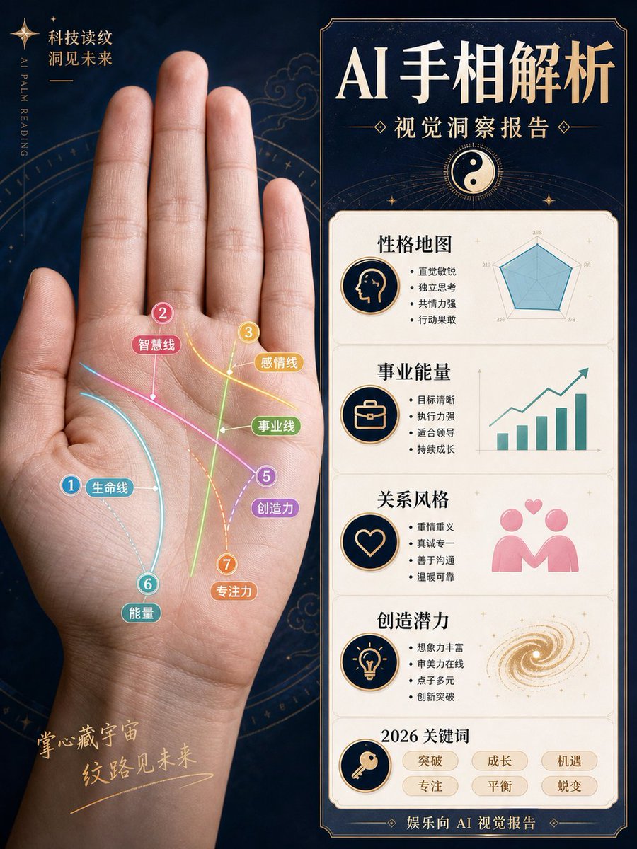
{"type":"Chinese magazine-style AI palm reading visual analysis report poster","format":"vertical 3:4 infographic poster","overall_style":"luxury mystic technology aesthetic, dark navy starry background, antique gold borders, clean editorial layout, high-end Chinese magazine typography, realistic photo mixed with flat infographic graphics, not fortune-telling but a visual observation report","main_subject":{"position":"left half","description":"a large realistic open human palm facing forward, wrist visible at bottom, fingers extended upward, softly lit skin texture, centered within a faint golden astrological compass circle","hand_photo":"{argument name="hand photo description" default="realistic left palm photo, open hand, fingers upright, natural skin tone"}"},"left_palm_overlay":{"count":7,"description":"seven colorful annotated palm lines drawn directly on the palm with glowing curved strokes, numbered circular markers, small rounded Chinese labels, thin connector dots","lines":[{"number":1,"label":"生命线","color":"cyan blue","position":"curving around the thumb mound"},{"number":2,"label":"智慧线","color":"pink","position":"diagonal line across the upper palm"},{"number":3,"label":"感情线","color":"yellow","position":"upper right palm near finger bases"},{"number":4,"label":"事业线","color":"green","position":"vertical line rising through the center palm"},{"number":5,"label":"创造力","color":"purple","position":"diagonal line toward lower right palm"},{"number":6,"label":"能量","color":"teal","position":"lower left palm near wrist"},{"number":7,"label":"专注力","color":"orange","position":"dotted vertical curve near lower center palm"}]},"left_background_text":{"top_left":"科技读纹\n洞见未来","vertical_english":"AI PALM READING","bottom_left":"掌心藏宇宙\n纹路见未来"},"right_panel":{"position":"right half","description":"tall bordered report card with dark navy header and cream content panels, gold trim and art deco corners","headline":"{argument name="headline text" default="AI 手相解析"}","subtitle":"{argument name="subtitle text" default="视觉洞察报告"}","header_icon":"yin-yang symbol in a golden circle with radiating lines","sections_count":5,"sections":[{"title":"性格地图","icon":"profile head silhouette in a navy-and-gold circle","text_bullets_count":4,"text_bullets":["直觉敏锐","独立思考","共情力强","行动果敢"],"visual":"teal radar chart with five axes"},{"title":"事业能量","icon":"briefcase in a navy-and-gold circle","text_bullets_count":4,"text_bullets":["目标清晰","执行力强","适合领导","持续成长"],"visual":"teal rising bar chart with upward arrow"},{"title":"关系风格","icon":"heart outline in a navy-and-gold circle","text_bullets_count":4,"text_bullets":["重情重义","真诚专一","善于沟通","温暖可靠"],"visual":"pink two-person relationship icon with floating hearts"},{"title":"创造潜力","icon":"light bulb in a navy-and-gold circle","text_bullets_count":4,"text_bullets":["想象力丰富","审美力在线","点子多元","创新突破"],"visual":"golden spiral galaxy swirl"},{"title":"2026 关键词","icon":"key in a navy-and-gold circle","keywords_count":6,"keywords":["突破","成长","机遇","专注","平衡","蜕变"]}],"footer":"娱乐向 AI 视觉报告"},"color_palette":"deep navy, cream white, antique gold, cyan, pink, yellow, green, purple, orange, teal","typography":"large bold elegant Chinese serif headline, smaller Chinese sans-serif bullet text, decorative gold separators","customization_notes":"Keep all Chinese text sharp and legible, preserve the exact section layout and counts, emphasize the combination of realistic palm photography and polished infographic analysis."}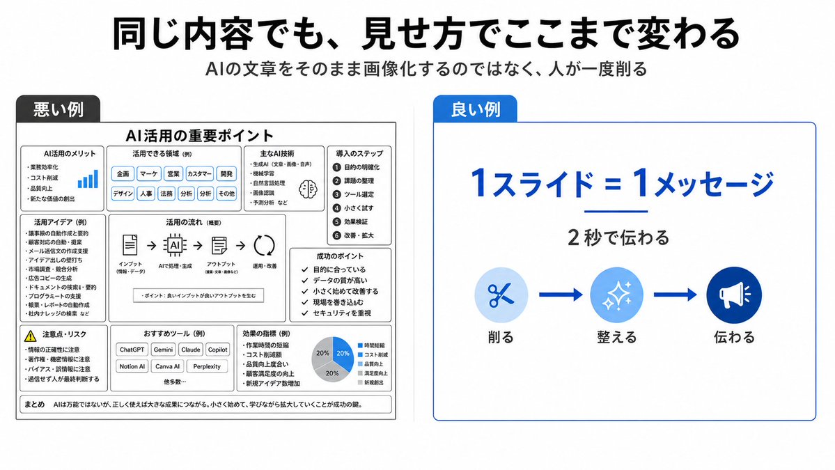
{"type":"clean Japanese presentation infographic comparing bad and good slide design","format":"wide 16:9 slide, white background, minimalist corporate style","headline":"{argument name=\"headline text\" default=\"同じ内容でも、見せ方でここまで変わる\"}","subtitle":"{argument name=\"subtitle text\" default=\"AIの文章をそのまま画像化するのではなく、人が一度削る\"}","layout":{"top":"large bold black Japanese headline centered, smaller gray subtitle centered underneath","comparison_panels":[{"title":"悪い例","position":"left half","style":"dense monochrome black and gray boxed slide with many tiny sections, intentionally cluttered and hard to read","main_heading":"AI活用の重要ポイント","section_count":9,"sections":[{"label":"AI活用のメリット","description":"small list with a tiny blue bar chart icon"},{"label":"活用できる領域(例)","description":"row of many pill tags such as 企画, マーケ, 営業, カスタマー, 開発, デザイン, 人事, 法務, 分析, その他"},{"label":"主なAI技術","description":"compact bullet list with a small brain icon"},{"label":"導入のステップ","description":"numbered vertical list of 6 steps: 1 目的の明確化, 2 課題の整理, 3 ツール選定, 4 小さく試す, 5 効果検証, 6 改善・拡大"},{"label":"活用アイデア(例)","description":"dense bullet list of use cases"},{"label":"活用の流れ(概要)","description":"horizontal process diagram with 5 icons connected by arrows: インプット, AIで処理・生成, アウトプット, 活用・改善"},{"label":"成功のポイント","description":"checklist of 5 short items"},{"label":"注意点・リスク","description":"warning triangle and risk bullet list"},{"label":"おすすめツール(例)","description":"small buttons for ChatGPT, Gemini, Claude, Copilot, Notion AI, Canva AI, Perplexity plus 他多数"}],"bottom_note":"まとめ AIは万能ではないが、正しく使えば大きな成果につながる。小さく始めて、学びながら拡大していくことが成功の鍵。"},{"title":"良い例","position":"right half","style":"simple spacious white card with thin blue border and a blue title tab","main_message":"{argument name=\"main message\" default=\"1スライド=1メッセージ\"}","sub_message":"{argument name=\"sub message\" default=\"2秒で伝わる\"}","visual_flow":{"count":3,"items":[{"label":"削る","icon":"scissors in pale blue circle"},{"label":"整える","icon":"sparkles in medium blue circle"},{"label":"伝わる","icon":"megaphone in dark blue circle"}],"connectors":"two thick blue arrows between the three icons"}}]},"colors":{"primary_blue":"#0057d8","light_blue":"#d6ebff","black":"#111111","gray":"#555555"},"typography":"bold modern Japanese sans-serif, strong hierarchy, right side very readable, left side deliberately overloaded","composition":"clear side-by-side contrast: cluttered bad example on the left and simplified good example on the right, with generous margins and crisp vector graphics"}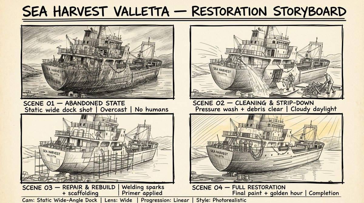
This Storyboard sheet use for this video created with GPT image 2 Storyboard sheet prompt: A professional hand drawn sketch storyboard sheet, pencil and ink illustration style, rough artistic linework, cross-hatching for shadows, loose expressive strokes, monochrome black and white on aged cream/off-white paper texture background, 2x2 grid layout with four equal storyboard panels bordered by thick hand-drawn black ink frames. Top-left panel sketch: abandoned rusted cargo ship at dock, heavy hatching for rust texture, broken railings, algae, seagulls, no humans, dark moody pencil shading, handwritten label below: "SCENE 01 — ABANDONED STATE | Static wide dock shot | Overcast | No humans". Top-right panel sketch: same ship with workers using pressure washers, dynamic water spray motion lines, figures in safety gear, debris piles, handwritten label: "SCENE 02 — CLEANING & STRIP-DOWN | Pressure wash + debris clear | Cloudy daylight". Bottom-left panel sketch: welding sparks as burst star lines, scaffolding structure, worker figures grinding and painting, primer sections with hatching, handwritten label: "SCENE 03 — REPAIR & REBUILD | Welding sparks + scaffolding | Primer applied". Bottom-right panel sketch: fully restored ship, clean hull, workers standing back, golden hour rays as radiating diagonal lines, handwritten label: "SCENE 04 — FULL RESTORATION | Final paint + golden hour | Completion". Bold hand-lettered title at top: "SEA HARVEST VALLETTA — RESTORATION STORYBOARD". Handwritten production notes at bottom: "Cam: Static Wide-Angle Dock | Lens: Wide | Progression: Linear | Style: Photorealistic". Pencil graphite texture, ink pen outlines, rough paper feel, professional film storyboard aesthetic.
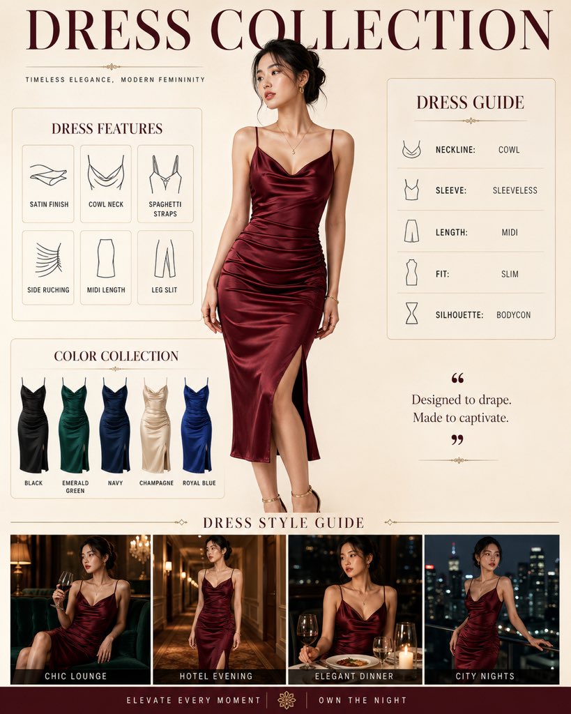
{
  "image_type": "Commercial Fashion Infographic",
  "subject": {
    "model": "Young Asian woman with elegant features and dark hair tied in a loose bun",
    "attire": "Satin midi dress with spaghetti straps and a draped cowl neckline",
    "fit": "Bodycon / slim fit with side ruching and a subtle leg slit"
  },
  "layout_structure": {
    "composition": "Multi-panel editorial layout",
    "header": "Bold serif typography reading 'DRESS COLLECTION'",
    "main_feature": "Large centered portrait of the model, a young Asian woman, wearing a wine-red satin dress",
    "secondary_panels": [
      "Dress Features grid with minimalist icons",
      "Dress Guide sidebar detailing neckline, sleeve, and length",
      "Color Collection row showing the dress in Black, Emerald Green, Navy, Champagne, and Royal Blue",
      "Dress Style Guide footer featuring the model in various atmospheric evening settings"
    ]
  },
  "aesthetic_style": {
    "color_palette": "Deep jewel tones (Wine Red, Emerald, Navy, Royal Blue) contrasted with Champagne and Black against a warm cream or beige background",
    "lighting": "Soft studio lighting with elegant highlights on the satin fabric texture",
    "vibe": "Luxurious, timeless, and sophisticated commercial advertising"
  },
  "typography": {
    "primary": "Classic Serif for titles",
    "secondary": "Clean Sans-Serif for body text and technical details"
  }
}